Current design problems
Before starting my design, I decided to interview classmates and peers to gather their thoughts and experiences with the current design of Microsoft Word.

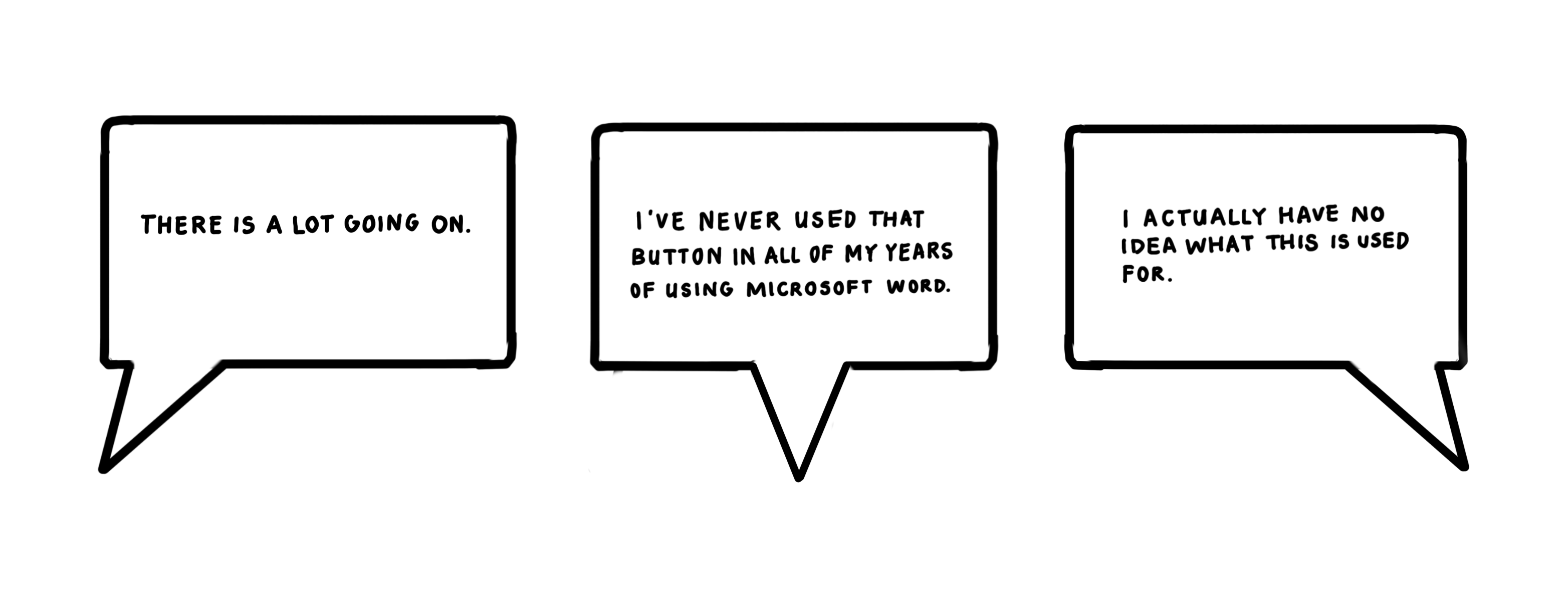
These were some of the concerns that were brought up when I interviewed different users about the current interface, and I used these concerns to form certain insights about current problems that exist with pre-existing design system.

Icon Overload
Some of the icons incorporate drop down menus, but not all. The toolbar is also filled with numerous icons that each represent a functional feature, and some of them rarely get used. By grouping & consolidating some of these icons, it would make the user's experience easier to find the functions they need right off the bat.
Quick Tools
These icons are outdated and most users seem to use quick commands instead of clicking directly on the icons. These quick tools begin to clutter the top part of the toolbar.
Styles Panel
The styles panel seems to be larger than the other parts of the toolbar, but the function doesn't justify it's size. Making this smaller could allow space to be used more efficiently, and could create a cleaner look all around.
Consistency
There were also four basic principles of consistency that I was cognizant of when coming up with the final version of my redesign.
Functional consistency
Refers to consistency of how certain functions are presented, how they operate and what they do.
Aesthetic consistency
Refers to a consistency of style and appearance or elements across a possible design solution.
Internal consistency
Refers to consistency with other elements in the system.
External consistency
Refers to consistency with other elements in the environement of the user.
UI INSPIRATION

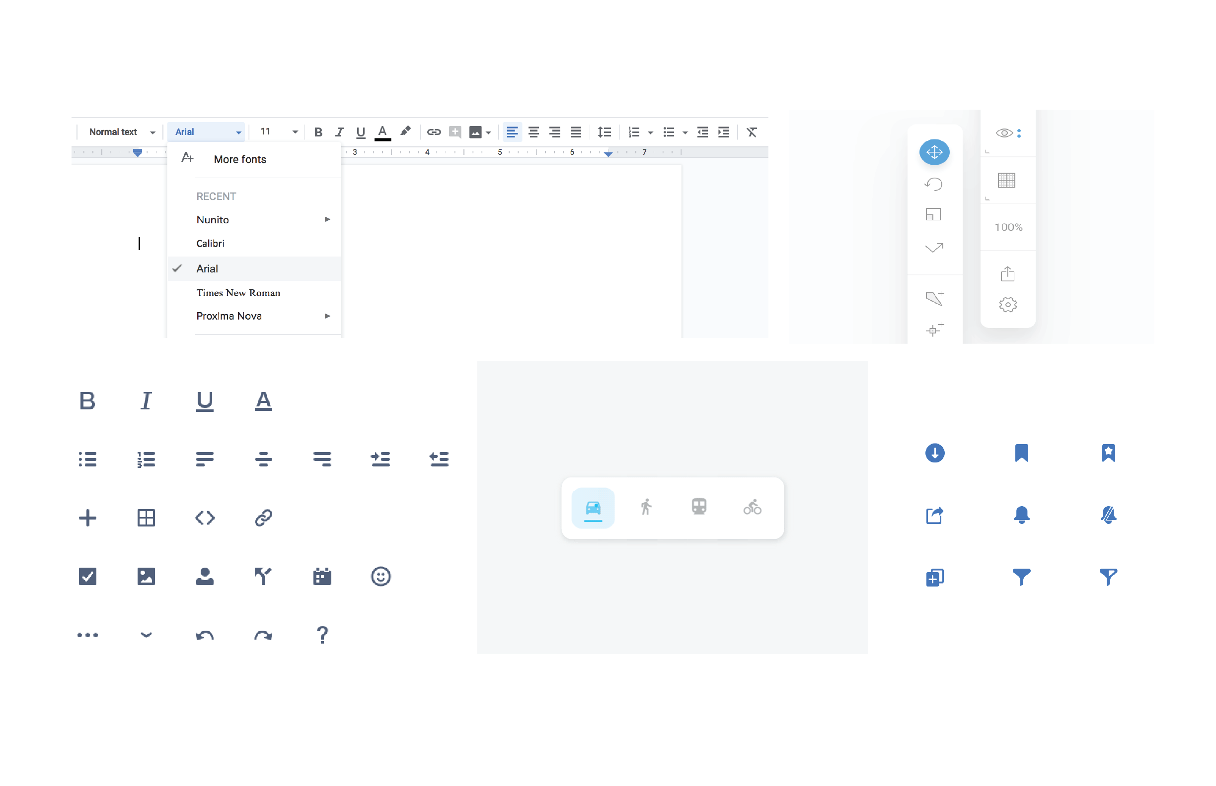
I wanted the toolbar to be simple and clean, with legible icons and minimal state changes, so I used these designs as inspiration for my UI. The design icons needed to be less complex in order to be more recognizeable.
First iteration
For my first iteration, I decided to keep the design simple and not cluttered, so I went with a single row of icons to make the UI feel less overwhelming. The choice of the lack of color was intended to keep the design clean, similarly to designs on my UI inspiration board. The quick tools were moved to the bottom of the toolbar for easy access.

I also hid the options for Cut, Copy, and Paste, under an Edit tab to save space on the toolbar, since most of the users I had interviewed had stated that they use the shortcuts for those functions.

Final Design
For the final design, I consolidated the icons of the toolbar into a single row. After further user research, I decided to move the Cut, Copy, and Paste Tools in place of where the Quick Tools where because some users who are unfamiliar with the shortcuts and would need these tools accessible. I then moved the Quick Tools into a collapsible menu to save space.
For changes to the visual design, I made the toolbar a gradient of the Microsoft Blue, to keep the brand's aesthetic consistency. Users are associate the blue with the application of Microsoft Word, so it also increases visibility to find the page among multiple pages on a desktop view, because of the color. I also added rounded corners to create a smoother and friendlier looking design, and also took this idea from my UI inspiration board.
Toolbar

State Changes


